In this release, you will find the following new capabilities, many of which are already available in Qlik Cloud today:
Visualizations and dashboards
New customization options for filter panes
App developers now have new ways to customize the appearance and functionality of filter panes. The listbox for each field or master dimension in a filter pane can be customized individually with multiple new properties. The following options are available:
- Hide the displayed title of the field.
- Remove search functionality for the field, or switch to Wildcard mode (inserts * characters around string).
- Compact view for optimizing space between values.
- Checkbox mode for alternative selection method.
- Histogram view to display the frequency of each value in the data.
- Grid layout with custom ordering and display options.
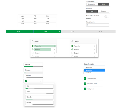
Table Exploration Menu
One of the most significant updates of the year, the new Straight Table significantly boosts self service capabilities with expanded exploratory analysis and reporting. It acts as a catch-all table, providing users with the flexibility to pick and choose how they would like their layout presented. Users can add many fields simultaneously, alternate dimensions and measures, customize column width, view the user field picker, choose pagination or virtual scroll, and store the layout in bookmarks.

Styling improvements to charts
New styling improvements are available for several Qlik Sense charts, giving app developers more customization options when building visualizations, allowing them to conform to company, department, or personal style standards and preferences.
New styling options have been added for the following charts:
Line charts can display larger datasets
App developers can now control the number of visible points and lines displayed in line charts. The maximum for visible points is 50,000. The maximum for visible lines is 1,000. These options are available for line charts with a continuous dimension axis.

Add background colors and images to charts
App developers can now add a custom background color or image to straight tables, pivot charts, pie charts, and bar charts. Any image in the media library can be used as a background. You can choose a single background color or color by expression.

Advanced authoring
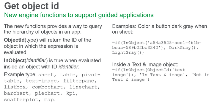
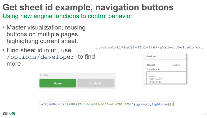
New chart functions for custom app navigation
The new chart functions ObjectId() and InObject() enable creation of guided applications with custom navigation functionality. For example, you can use the functions in conditional expressions to create colored buttons to navigate between sheets in an app.
The functions give access to the hierarchy of objects in a Qlik Sense app. ObjectId() will return the ID of the object in which the expression is evaluated. The function takes one optional string parameter, which can specify the type of the object you’re looking for. ObjectId(‘sheet’) will return the ID for the sheet of the expression. InObject(ID) is true when evaluated inside an object with the specified ID.
InObject – chart function
ObjectId – chart function
Connectors
New Google Analytics 4 connector
The Google Analytics 4 connector extracts traffic and engagement metrics from your Google Analytics 4-enabled websites and apps and loads that data into your Qlik Sense apps.
Google is replacing Universal Analytics with Google Analytics 4. For more information about this change, see Google Analytics Help.
Google Analytics 4